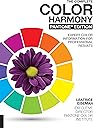
The Complete Color Harmony, Pantone Edition: Expert Color Information for Professional Results
Product ID: 253623681
Desertcart purchases this item on your behalf and handles shipping, customs, and support to Greece.
The bestselling color reference guide―updated from cover to cover by color expert Leatrice Eiseman, executive director of the Pantone Color Institute. Color is the single most important design element in creating mood and style. It influences our feelings, our well-being, and our perceptions. It’s the visual cue that engages us, draws us in, and connects us to our environment and the things we love. The Complete Color Harmony, Pantone Edition , is your comprehensive guide to harnessing this extraordinary power. Inside, Eiseman covers every aspect of color: The foundations of color theory , including the biology of seeing color, basic terminology like hue and saturation, color harmony, color temperature, and the color wheel The psychology of color , with a psychological and cultural analysis of each color of the rainbow 30 curated color moods ―from Playful to Nostalgic, Reliable to Transcendent―each paired with 36 Pantone color combinations Personal colors ―what your color likes and dislikes say about your personality Color trends and forecasting , their commercial origins, and how and where trend information is gathered Whether you’re seeking color inspiration for your next design, art, or craft project, looking to evoke specific moods through color, or simply curious about its possibilities, The Complete Color Harmony, Pantone Edition is the definitive guide. Review: Good reference point book - Good book for reference Review: Amazing - Very useful


| Best Sellers Rank | #27,232 in Books ( See Top 100 in Books ) #38 in Computer Graphics & Design #58 in Decorative Arts #84 in Art Criticism |
| Customer Reviews | 4.7 out of 5 stars 1,268 Reviews |
J**R
Good reference point book
Good book for reference
D**A
Amazing
Very useful
A**A
Must have for creatives
Absolutely love this book. It’s a great tool to have in your kit if you’re a creative of any sort. Lots of combinations both classic and unexpected.
S**Y
Perfect and delightful
Thanks!!!
E**O
Great Book!!
one of the greatest books you can get on color,it explained how we physically perceive different colors and shows a lot of combinations. Really useful!! even after reading it I find my self opening it again to check for things as I design. so it’s not just theory, it’s a tool that can be used whenever, just open the book and work with it.
J**Y
Better &More Useful than the Originals - and That's Saying Something
I have owned and loved several different editions of the Color Harmony books over the years, including one in Japanese. The first one came out in English thirty years ago, in 1987. The different volumes used a set palette of colors and then showed them in combinations of two to four colors. Most of the volumes have color cards in the back that make up for the rather small swatches in the color palette pictures themselves. The first two volumes of Color Harmony look at color in different ways. The first volume divides the combinations into categories similar to the ones we are used to considering. The second volume which came out ten years later looks at color schemes according to mood. Within each mood, they divide the combinations into sections by color scheme. This volume is unique because it actually provides you with neutral suggestions for each mood, although its definition of neutral is very narrow. I was excited to see that this new edition with the cooperation of Pantone was coming out. The book opens with a text section which is excellent. There are chapters on different aspects of color as well as chapters on the psychology of color, featuring a baker's dozen different colors. While I don't always agree with their interpretations, it's interesting to read. As one would expect from a Pantone book, the color pictures are ravishing and the text is well written. The next sections, and the bulk of the book, cover color and mood. I really liked that it expanded the areas covered in these chapters to include subjects like fashion and interior design. Older versions focused too much on the needs of graphic artists. This also makes it more useful for us as needlepointers. Just looking at one page at random, from Provocative, I can see hot pink, in several Pantone colors, used as main, secondary, and accent colors in combinations that include everything from bright orange to rich teals. It gives me so many ideas for needlepoint! (In a future post will look at exactly how to translate these combinations to needlepoint.) The palettes in the book reflect a wider audience as well with many of the palettes containing color schemes too subtle to work in packaging and in other graphic design applications. But they could make great schemes for rooms or clothing or fiber art! Some of my favorite palettes are these, many in the section Delicate. While I probably wouldn't use them as is; these pale almost white schemes have given me so many ideas for backgrounds. The color palettes, which are keyed to colors in the Pantone system, are shown for each of the color moods in the second half of the book. They are shown in rings with the colors in proportion to dominant, secondary, and accent. No other numbering system is shown, you will need another reference for that. While I like the proportional display, I'm not sure that I like the rings. The white space in the center is distracting. On the plus side, it does allow presentation of a dozen palettes per page without them seeming crowded. This is great compared to the 2q4 small combination shown per page in the original books. The later text sections of the book look at psychological aspects of color with sections on color personality, the affect of color on our lives, and color forecasting, among other topics. These sections also have many intriguing ideas. The Color Harmony books have a wonderful ability to help you look at color in a new way. They have probably been more influential in how I think about and use color than any other books except the ones specifically about color in needlework. Because of them I have become braver in how I think about color and in how I combine them. However the earlier versions skewed a bit too much to graphic artists for me to adapt many of the schemes. Because Pantone as a company works with a much broader audience, these palettes are ones that I will cheerfully and quickly adopt. This is a worthy addition to the series.
A**A
I like it.
Gives quite a nice color combinations to follow if ypu lok for some inspirations.
Trustpilot
1 month ago
1 month ago